
Slack, UCR’s virtual communication and collaboration platform, is introducing a redesigned interface that helps users stay organized, focused, and productive. This major design update is coming to UCR’s Slack Enterprise Grid on December 19, 2023.
Before we jump into what’s changing, let’s start with what will stay the same. You’ll still be able to see all your channels, direct messages, and apps from a single view, now called Home. If you’re part of multiple workspaces within the UCR Slack Enterprise Grid, you will soon have the ability to view channels from every workspace, all in Home — no more toggling back and forth.
A Streamlined View of Your Go-to Slack Features
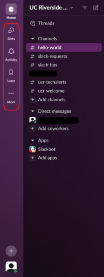
At the heart of Slack’s new design are dedicated views to help you focus your attention and maintain momentum on your work. Here are the features you can look forward to in the new Slack interface:
- DMs — A new, dedicated view for all your direct messages
- Activity — A place for everything that needs your attention: mentions, threads, reactions, and app notifications
- Later — A place to stash conversations and notifications that you want to come back to. You can also set a reminder to make sure your action item is completed on time.
- More — Provides quick access to tools that boost your productivity, such as canvas, workflows, and apps
Bird's Eye or Focused View
Don’t worry — you’re still able to narrow your view to a specific workspace. The updated interface includes two new feature which allow you to toggle between different workspaces within the UCR Slack Enterprise Grid or between external workspaces.
The workspace switcher should feel familiar, as it mimics the functionality of the old interface by providing a side menu with workspace icons. Please note that if you are part of Slack communities outside of the "UC Riverside" Slack Enterprise Grid, you will see your external Slack community icons here instead. You can open the workspace switcher menu by clicking on the workspace icon located in the upper-left hand of the Slack client.
Note: If you are part of more than one Grid environment and you want to switch between workspaces within the same Grid (e.g., the "UCR Community" workspace within the "UC Riverside" Slack Enterprise Grid), instead of using the workspace switcher you will click the All workspaces dropdown that appears below the Grid name in your left-side menu to select a single workspace. Selecting a single workspace will limit your menu view to only those channels within the workspace you select, narrowing your focus if you do not want to see all of your channel activity across workspaces.
Your Most Useful Tools Are Now Only One Click Away
In the new Slack design you will see a Create button. Clicking it opens a menu of tools, making it easier to start a new message, initiate a huddle, create notes in Slack’s new “canvas” note feature, and start a new channel.
Slack also updated the Search experience in a way that allows you to click on each result to see its full context without having to jump back and forth as you look for what you need.
Learn More About Slack’s New Design
For more on what’s changing in Slack, check out the overview of the new design. This resource also provides useful FAQs, such as how to find your Slack profile and status in the updated interface and how to change your Slack app’s theme.